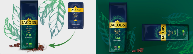
Supporting sustainability in packaging design
Hercules was briefed to create a new packaging design for the bio variant of Jacobs Medaille d’Or.
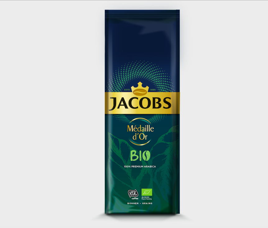
Being bio, Hercules’ designers wanted to focus on something simple and organic in terms of look and feel, while at the same time respect the Jacobs brand guidelines. The design retained the Medaille d’Or blue to ensure continuity with the original packaging, but introduced an element of Jacobs green to bring it closer to the Jacobs brand (green is also a natural color for the bio range). From a design point of view, we chose to create a gradient from dark blue to green tones, in line with modern design trends. The vector illustration of the leaves delivers authenticity and is a distinguishing mark, while the hand-drawn style of illustration symbolizes care and nature. These graphic cues were brought to life with a special printing technique that allowed us to optimize the metallic shine already present in the packaging material.